Making laboratory inventory clearer
A new inventory system for clinical labs, designed for the people who scan reagents every day.
- Role
- UX Lead, via Nacar Design
- Timeline
- May 2024 to March 2026
- Team
- Spain, Switzerland and India
- Tools
- Figma
Overview
Replacing a tool people avoided
Clinical labs were running on a third-party inventory solution that Roche decided to replace with its own. It had been designed by developers, for developers, and it was so hard to use that labs configured it badly or did not want to use it at all.
As UX Lead, I was responsible for the experience of the whole product. The team was large and spread across Spain, Switzerland and India: product owners, a technical product manager, a program lead, a business manager, UX and UI designers, and front-end and back-end developers.
Research
Too many small decisions
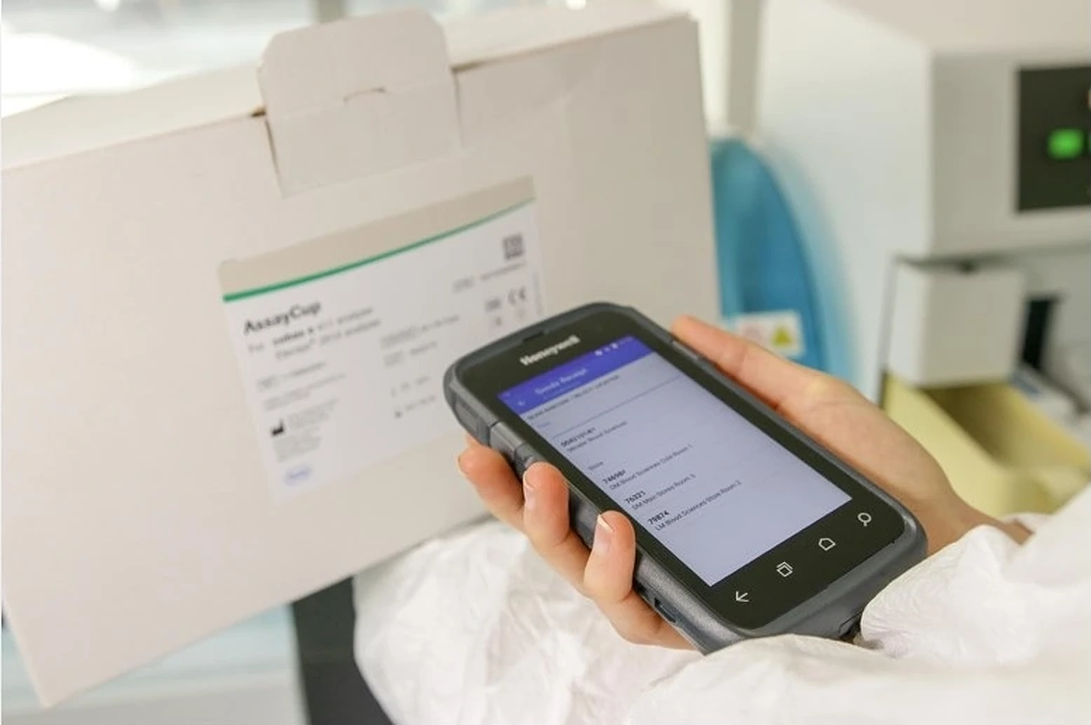
Lab technicians use the system every day: they scan each reagent with a handheld device every time they use it. Lab managers check stock and orders a few times a week. The product’s biggest advantage is automatic ordering, weekly or following each manager’s preferences.
Setting up those automatic orders was where people got stuck. The old system spread it across more than five screens, full of small choices that affected each other. Labs usually needed a Roche distributor to finish it.
Too many decisions, in the wrong order, spread across too many places.
Design
One screen for automatic orders
I brought the whole flow into a single screen, in the order a lab manager thinks about it. Date and time can be changed on the same screen, without starting over.
- Choose when
- Pick the products
- Adjust date and time
Stakeholders
Aligning people attached to the old tool
One of our main stakeholders had worked for more than 20 years on the solution we were replacing, and was deeply attached to it. He was not very comfortable with technology, so anything different felt hard to him, and he assumed users felt the same.
I was always careful in those conversations, and I brought outside evidence instead of opinions. Sometimes it convinced him. Sometimes it did not, and a decision moved to a future release. Picking the right battles, and keeping the relationship for the next one, was part of the job.
Outcome
A pilot that asked for more
We ran usability tests with about 5 former lab managers and 1 current lab manager who uses the legacy system every day. He said the new flow was much easier than the one he uses today.
Then we piloted the system in 2 laboratories in Italy, with people who had never used a Roche system but knew other inventory tools. They praised it and asked to extend the pilot from 3 to 6 months. The system is now reaching its first users, so post-launch metrics are not available yet.
Reflection
Simplicity needs allies.
Most of the complexity here was not technical. It lived in the number of decisions we asked people to make, and in the habits a 20-year-old tool left behind, in users and in the team. Simplifying the ordering flow was a design decision; getting it approved was a stakeholder decision. I learned to prepare for both.